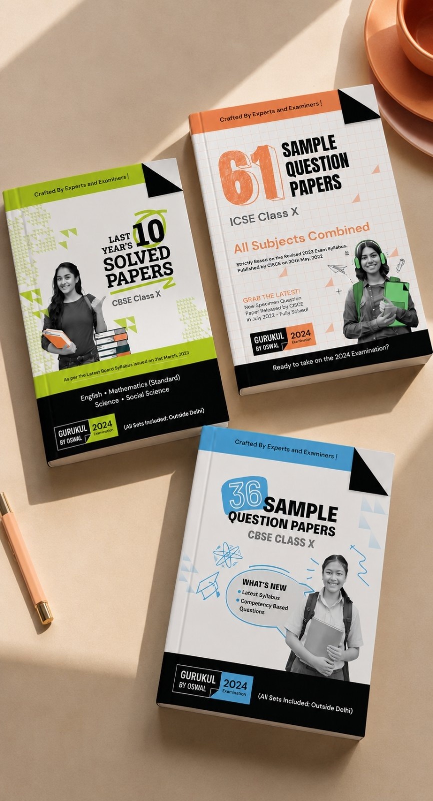

How a sprawling legacy brand with too many sub-brands became one coherent story for a new generation.

How a sprawling legacy brand with too many sub-brands became one coherent story for a new generation.

How a sprawling legacy brand with too many sub-brands became one coherent story for a new generation.

The Brief

Oswal Publishers is one of India's most established educational publishing houses, a brand generations of Indian students have studied with, sat exams alongside, and dog-eared the pages of. Over decades, the company had grown sideways as much as forward, accumulating multiple sub-brands across CBSE, ICSE, and other education boards. The result was a portfolio that worked, but a brand architecture that confused everyone, students, teachers, parents, even the company itself. The brief was to simplify all of it. To take a sprawling legacy and turn it into one coherent brand story, designed for the next generation of students without losing the trust the last few generations had built.

Industry

Educational Publishing

Services

Brand Strategy · Brand Architecture · Identity · Positioning · Tone of Voice · Brand Guidelines

Category

A 100-year-old publishing brand, rebuilt for the next 100

Client

Oswal Publishers

The Challenge

Legacy brands face a particular trap. The equity is real, but the equity is also fragmented — built up across decades of decisions made one at a time, with no one stepping back to ask what it all added up to. Oswal had over three decades of distribution, 1,000+ distributors, 5 lac+ copies, 250+ titles, and a customer base that genuinely trusted the name. The problem wasn't credibility. It was clarity. Too many sub-brands, no single unifying story, and a visual identity that no longer matched the moment Indian education was in. The rebrand had to keep everything the audience already trusted, and rebuild everything they didn't yet have words for.

The Brief

Oswal Publishers is one of India's most established educational publishing houses, a brand generations of Indian students have studied with, sat exams alongside, and dog-eared the pages of. Over decades, the company had grown sideways as much as forward, accumulating multiple sub-brands across CBSE, ICSE, and other education boards. The result was a portfolio that worked, but a brand architecture that confused everyone, students, teachers, parents, even the company itself. The brief was to simplify all of it. To take a sprawling legacy and turn it into one coherent brand story, designed for the next generation of students without losing the trust the last few generations had built.

Industry

Educational Publishing

Services

Brand Strategy · Brand Architecture · Identity · Positioning · Tone of Voice · Brand Guidelines

Category

A 100-year-old publishing brand, rebuilt for the next 100

Client

Oswal Publishers

The Challenge

Legacy brands face a particular trap. The equity is real, but the equity is also fragmented — built up across decades of decisions made one at a time, with no one stepping back to ask what it all added up to. Oswal had over three decades of distribution, 1,000+ distributors, 5 lac+ copies, 250+ titles, and a customer base that genuinely trusted the name. The problem wasn't credibility. It was clarity. Too many sub-brands, no single unifying story, and a visual identity that no longer matched the moment Indian education was in. The rebrand had to keep everything the audience already trusted, and rebuild everything they didn't yet have words for.

The Brief

Oswal Publishers is one of India's most established educational publishing houses, a brand generations of Indian students have studied with, sat exams alongside, and dog-eared the pages of. Over decades, the company had grown sideways as much as forward, accumulating multiple sub-brands across CBSE, ICSE, and other education boards. The result was a portfolio that worked, but a brand architecture that confused everyone, students, teachers, parents, even the company itself. The brief was to simplify all of it. To take a sprawling legacy and turn it into one coherent brand story, designed for the next generation of students without losing the trust the last few generations had built.

Industry

Educational Publishing

Services

Brand Strategy · Brand Architecture · Identity · Positioning · Tone of Voice · Brand Guidelines

Category

A 100-year-old publishing brand, rebuilt for the next 100

Client

Oswal Publishers

The Challenge

Legacy brands face a particular trap. The equity is real, but the equity is also fragmented — built up across decades of decisions made one at a time, with no one stepping back to ask what it all added up to. Oswal had over three decades of distribution, 1,000+ distributors, 5 lac+ copies, 250+ titles, and a customer base that genuinely trusted the name. The problem wasn't credibility. It was clarity. Too many sub-brands, no single unifying story, and a visual identity that no longer matched the moment Indian education was in. The rebrand had to keep everything the audience already trusted, and rebuild everything they didn't yet have words for.

THE APPROACH

We started with the architecture, not the artwork, mapping the entire brand portfolio and asking the question no one had: what is this brand actually trying to say to a student in 2023, and what's getting in the way of it saying that? The answer became the strategic anchor of the rebrand, Oswal as the modern-day Sage in a Gurukul. Not a textbook publisher, but a trusted companion on the student's journey, reinforcing what schools begin, never replacing them.


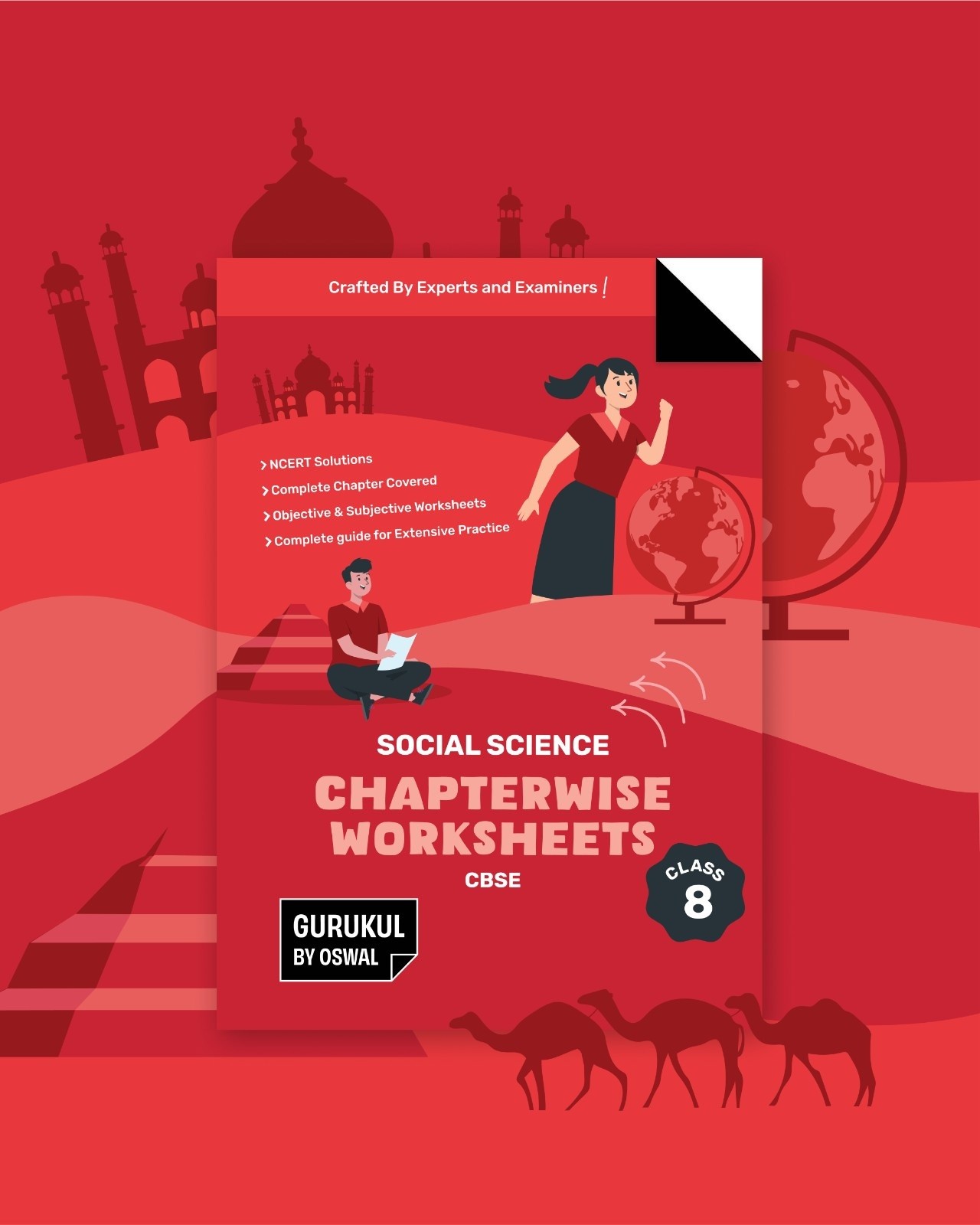
From there, the architecture was rationalised into a clear parent brand with a clean imprint system underneath it, and the brand story, positioning, and tone of voice were written to carry the new clarity across every touchpoint. The visual identity, developed in partnership with 9133 Design Studio, came to life around a single, deliberately literal idea: the dog-eared page. Every well-used textbook eventually has one, and that single fold became the brand mark, recognisable, ownable, and a quiet tribute to the way Oswal books actually live in students' bags.

THE WORK

A full rebrand for Oswal Publishers. Brand strategy, architecture rationalisation, positioning, brand story, tone of voice, and the visual identity system, rolled out across book covers, the website, print and digital collateral, and social media. The full system documented in a comprehensive brand guidelines book that now serves as the reference for every piece of work Oswal does going forward.
THE OUTCOME

A brand with over three decades of equity now telling a single, coherent story, recognisable to the parents who studied with Oswal, relevant to the students using it today, and architecturally clean enough to grow into the next decade without sprawling again.


For us, it was a reminder that the hardest rebrand isn't the one that starts from a blank page. It's the one that has to carry forward what already works while clearing away what doesn't. The work isn't in inventing a brand. It's in finding the one that was already there, and finally letting it show.

Let's Connect

contact-bg

We've been waiting
for a brief like yours.

We say that to everyone. We mean it every time.

Let's Connect

contact-bg

We've been waiting
for a brief like yours.

We say that to everyone. We mean it every time.

Let's Connect

contact-bg

We've been waiting
for a brief like yours.

We say that to everyone. We mean it every time.

I can't send dm on YouTube You Know But here is the code: